
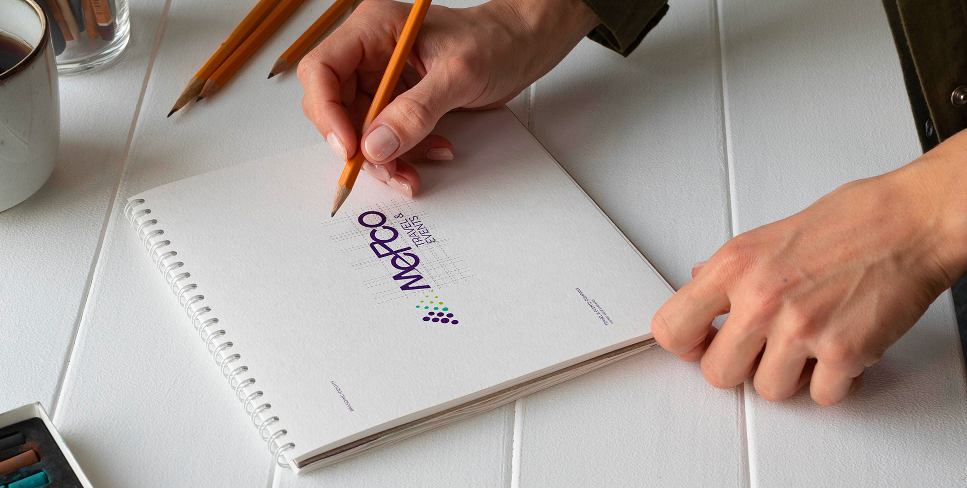
Branding & Design
Brand Consultancy
Product & Package Design
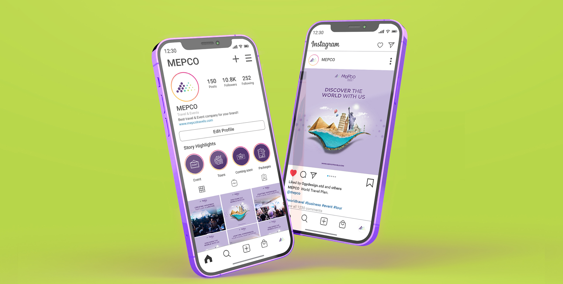
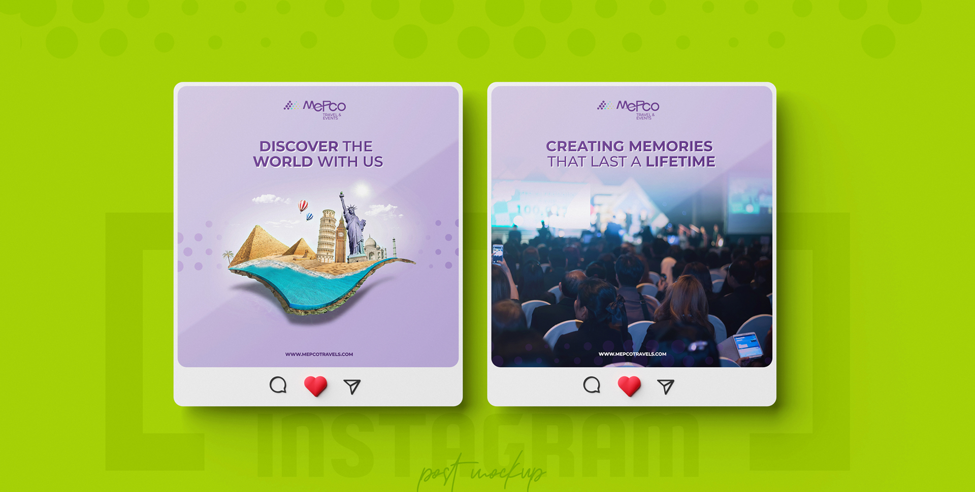
Online Media
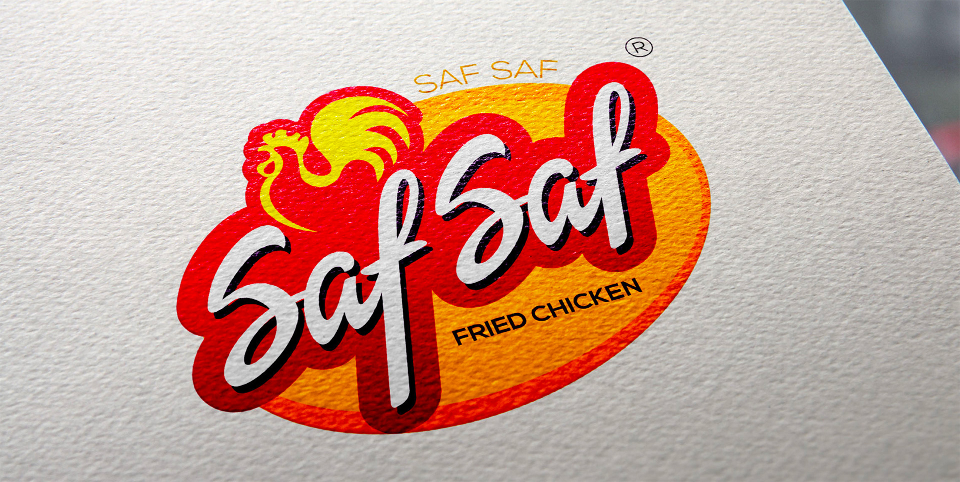
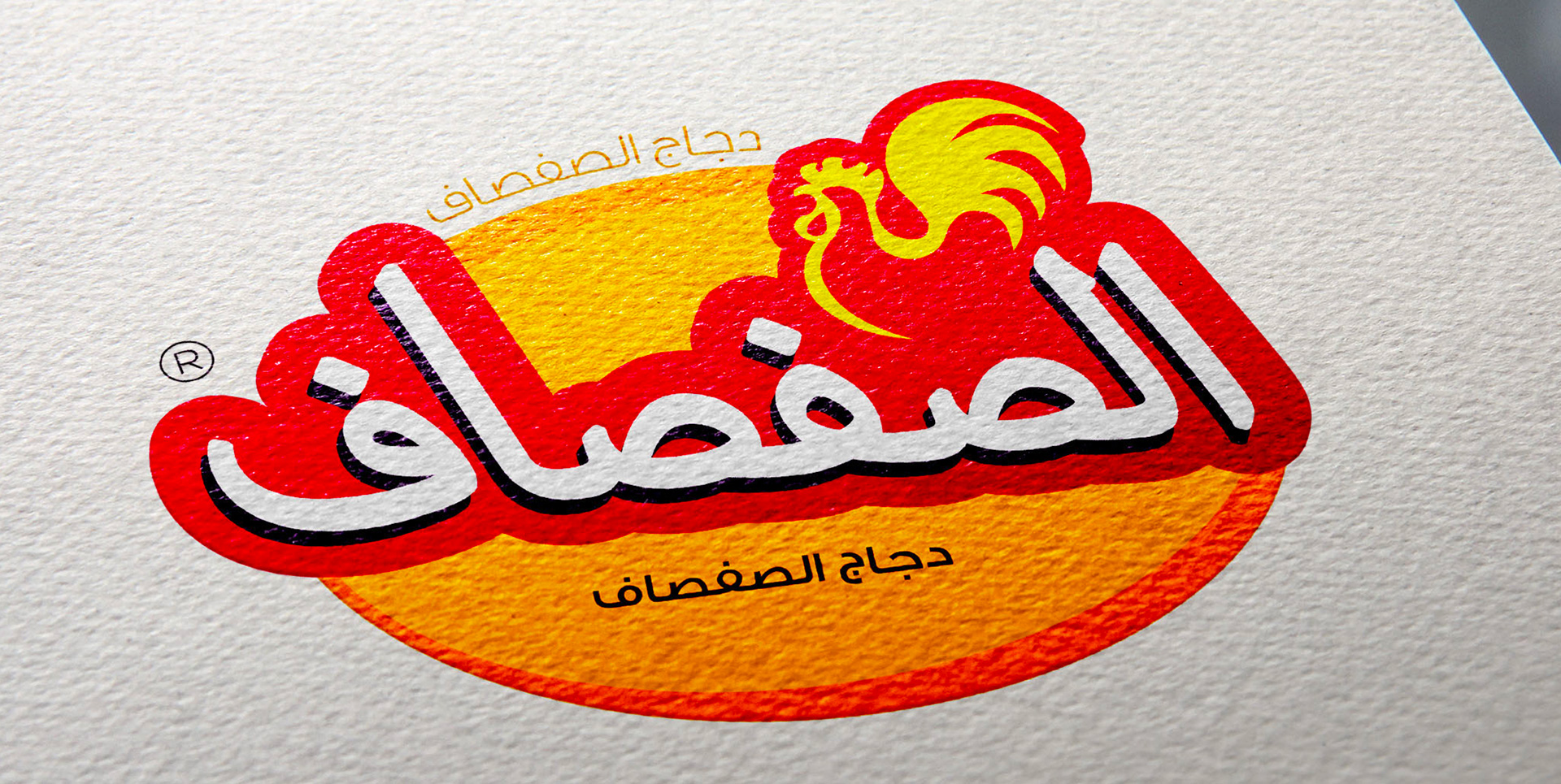
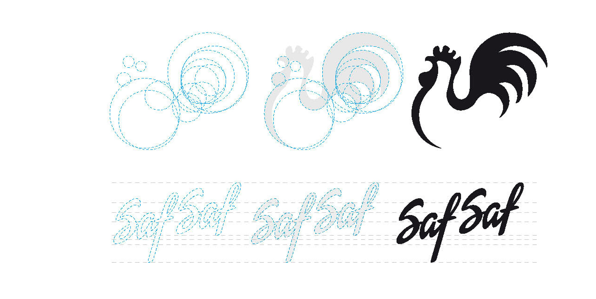
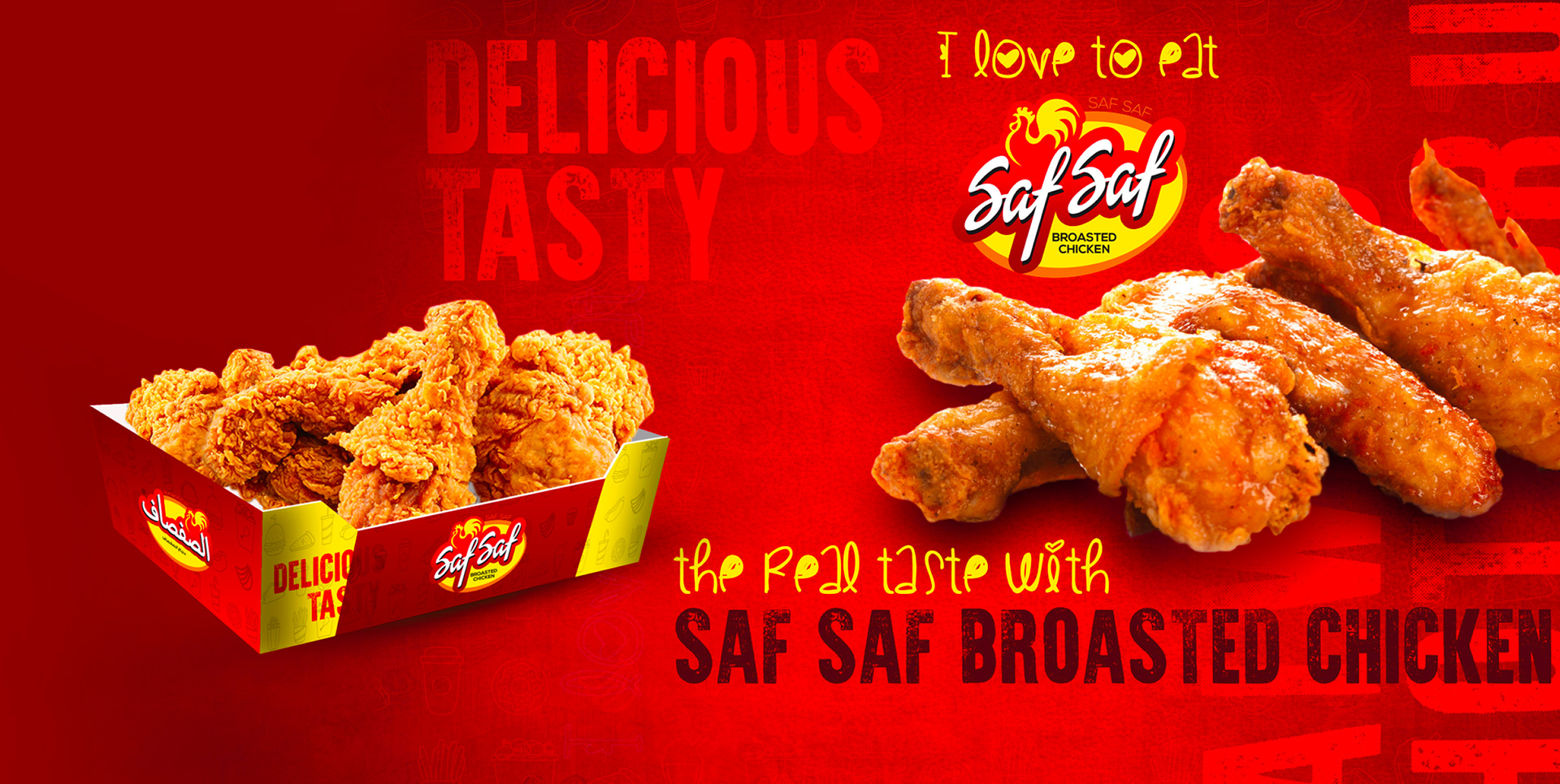
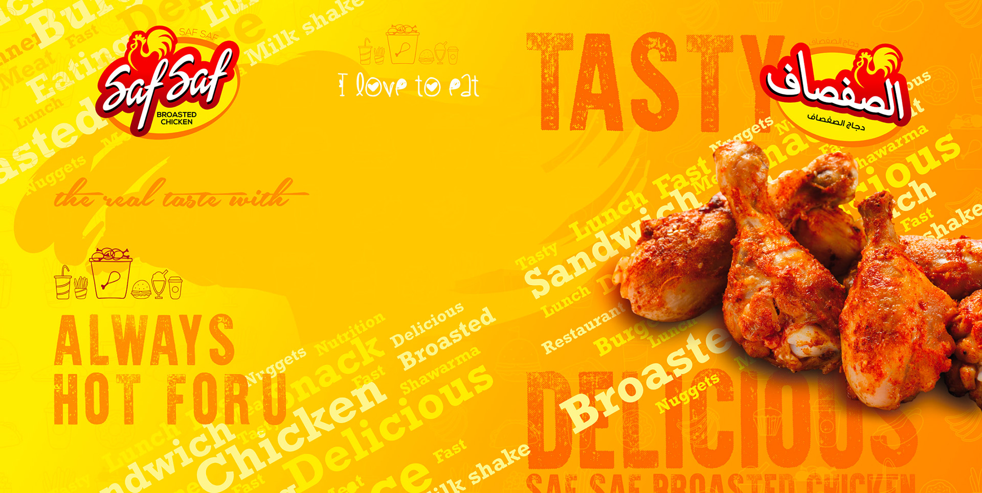
FMCG - Saudi Arabia
Entering the fiercely competitive food industry, Saf Saf had a unique demand: to stand out in a market saturated with multinational brands. They wanted a design that shared similarities in color blending with competitors but was distinctively different. Sounds challenging, doesn't it?
The result was truly remarkable. Saf Saf's brand seamlessly integrated into the minds of foodies with an international flair to the logo. Now, they've become one of the main players in the industry—an undeniable "wow" factor. Mad Concepts is thrilled to have been a part of your success!
In order to set the tone of the campaign I needed to create key art that was dynamic and vibrant, something that felt communal. In order to do this I ended up creating a collage aesthetic that had a few key elements. Firstly I knew I wanted to involve signs, because this year has become a year of protest, and signs are an important symbol of that. Closely tied to the signs are the images of hands and fists. I wanted to show a clear connection from the messages in the signs to the communities who are speaking out. Lastly I wanted to use a mix of halftone images, and paint textures, these two aesthetics have a long history with protest art, and they felt appropriate to round out the campaign's aesthetic.
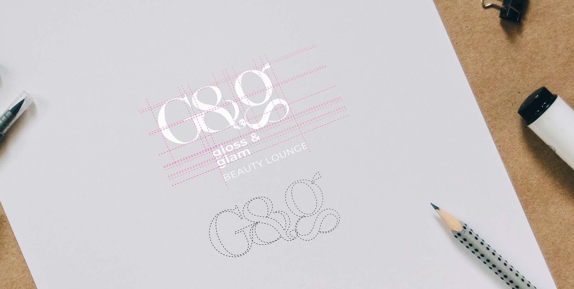
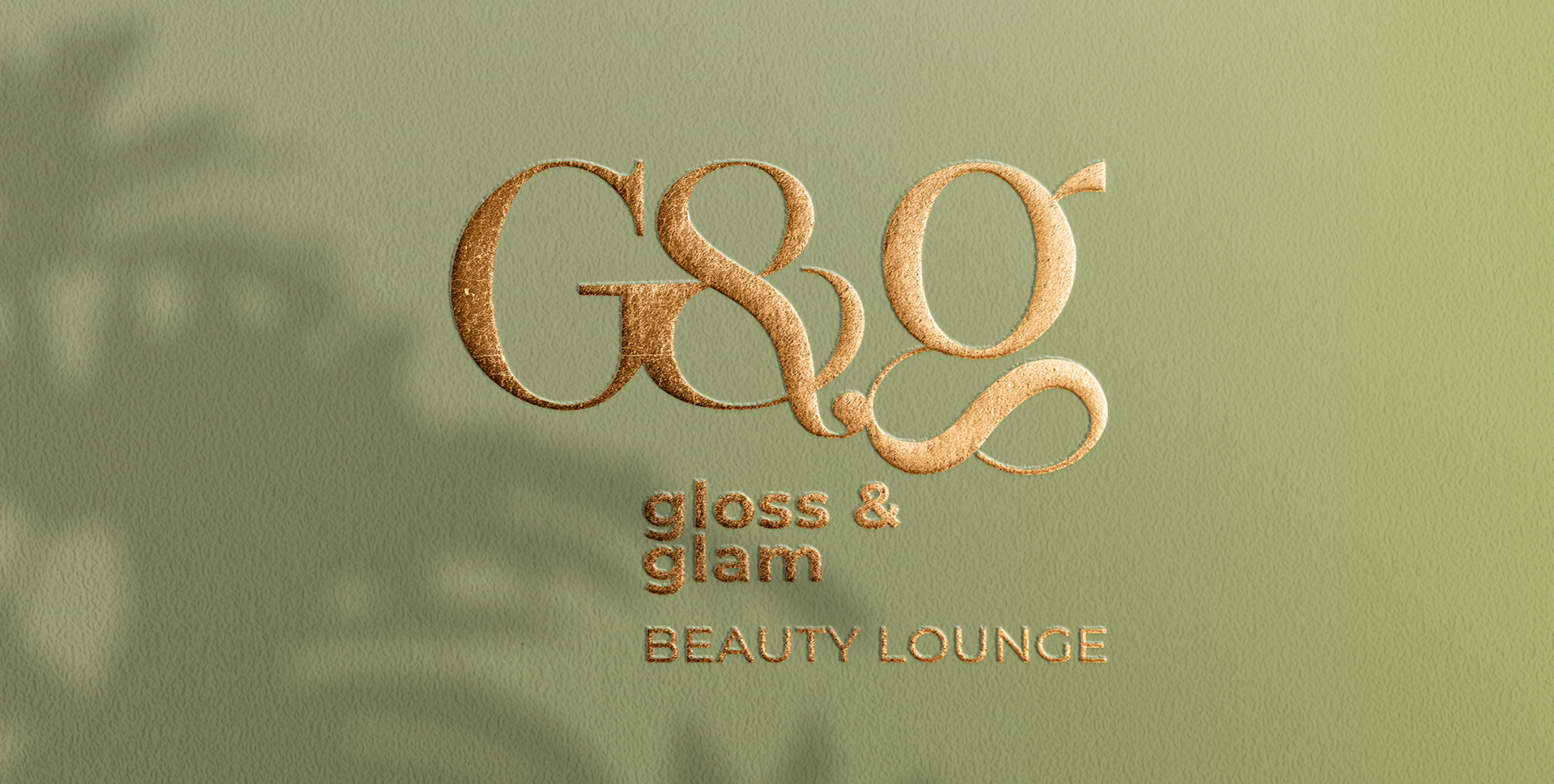
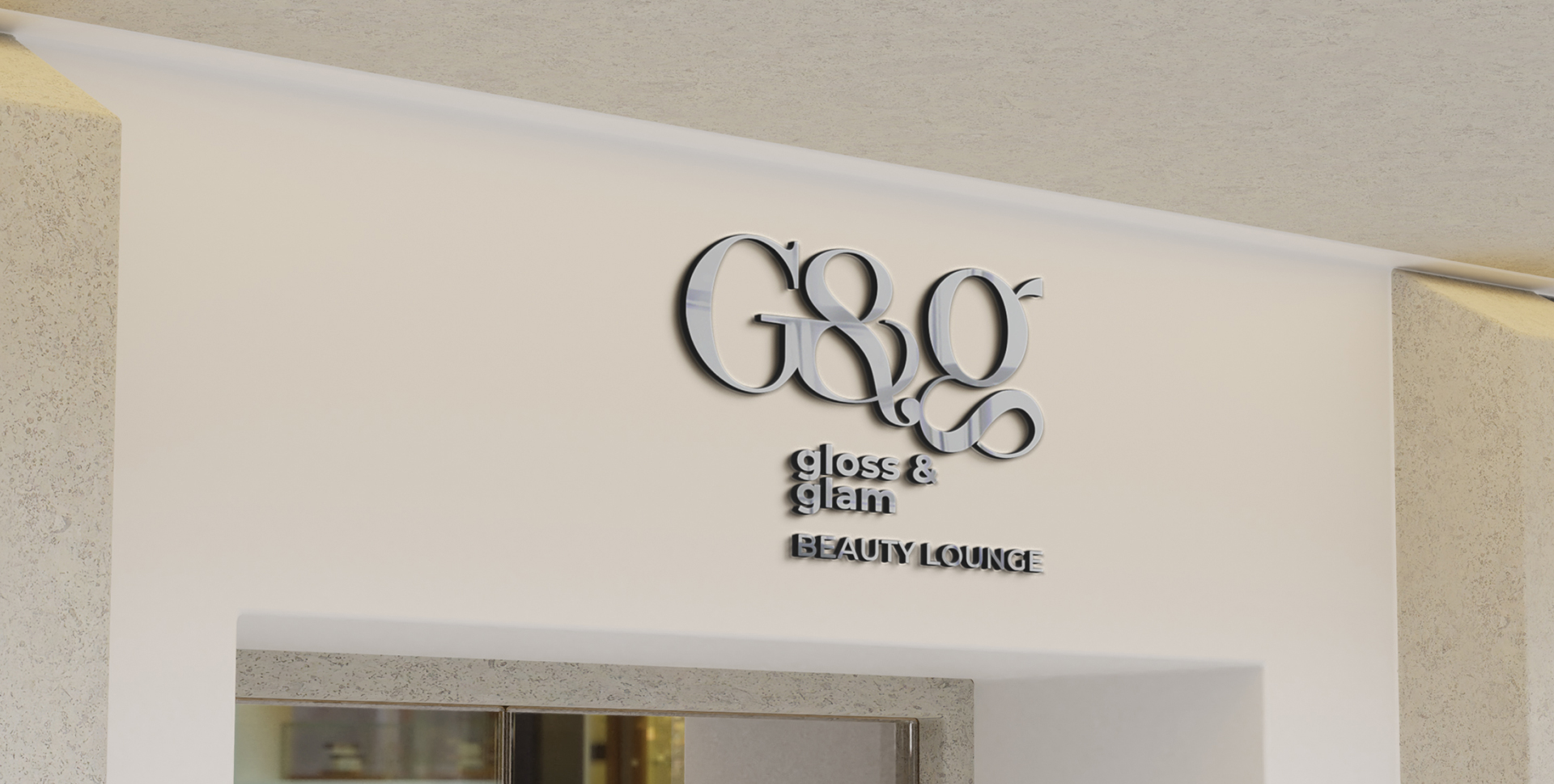
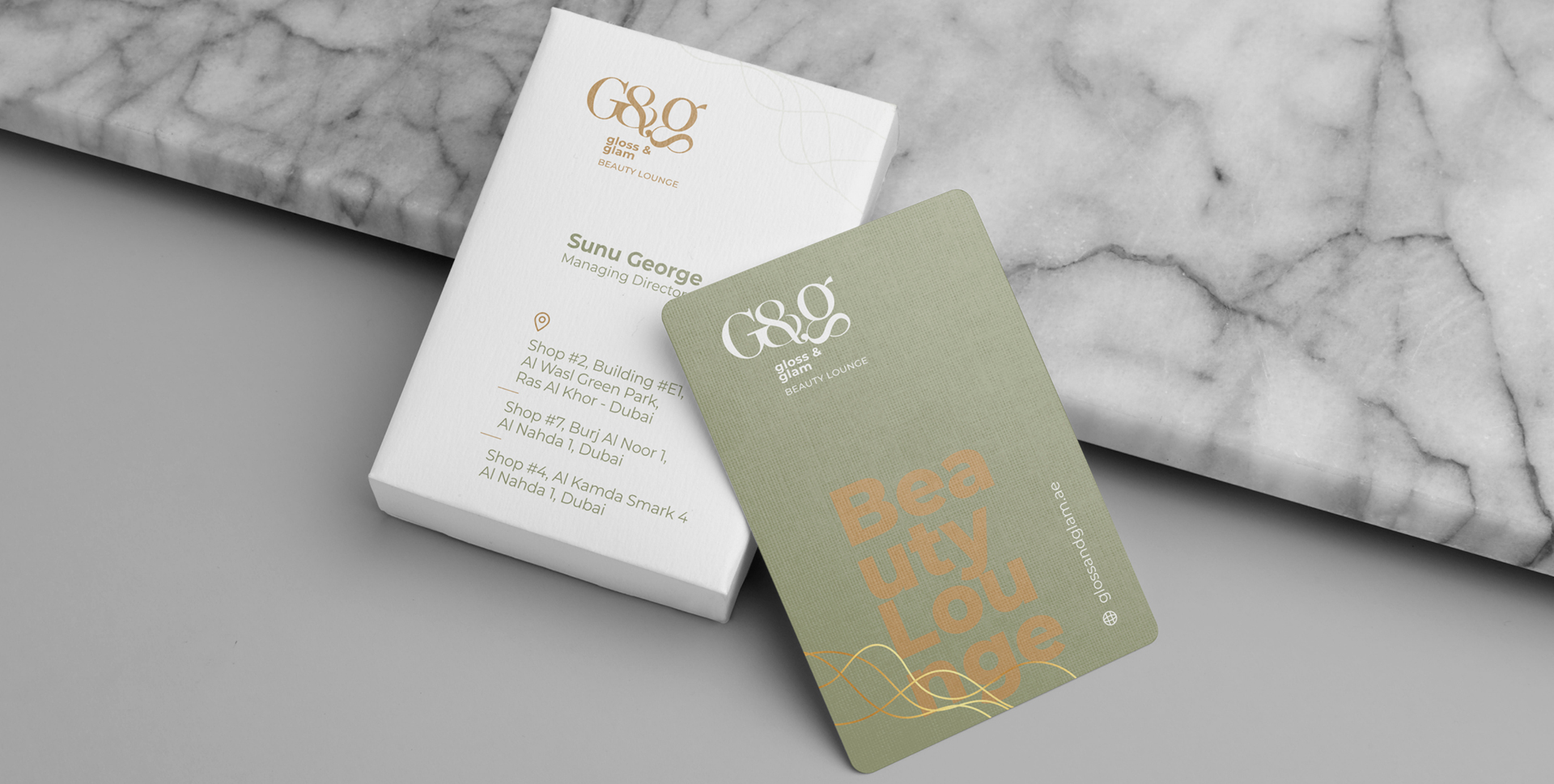
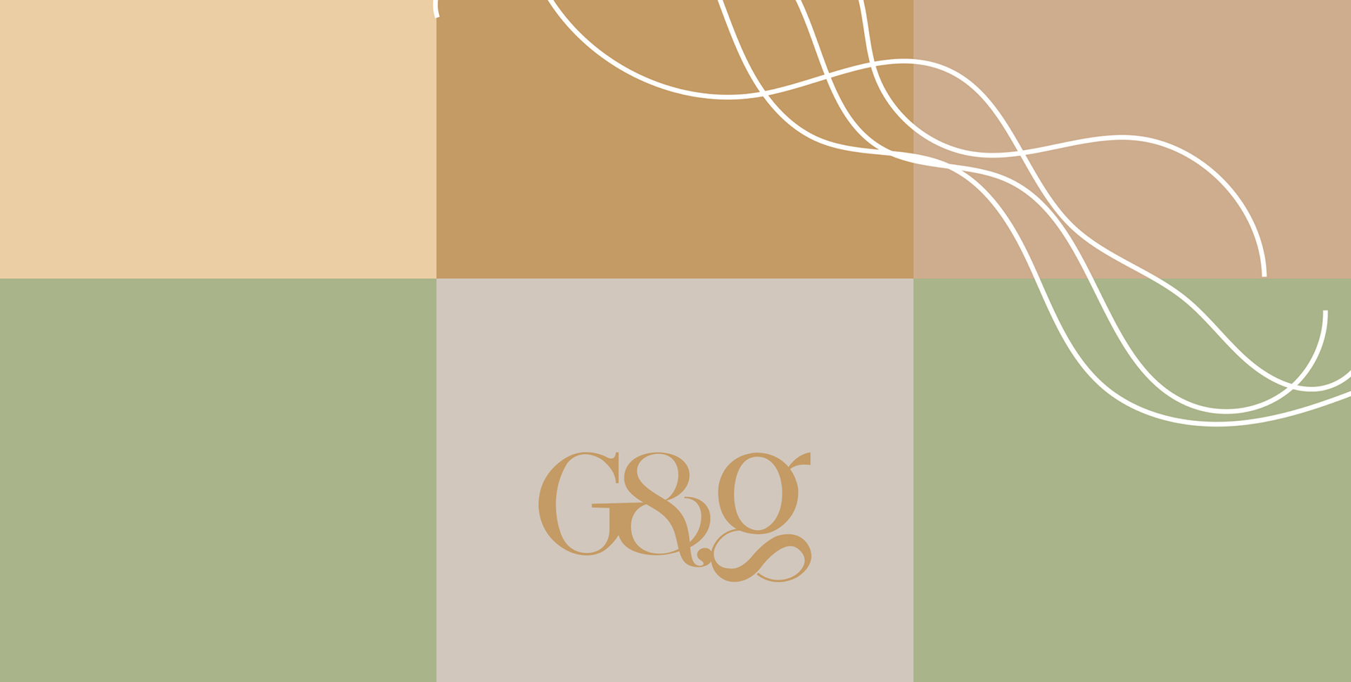
When G & G, now a giant in the salon industry, approached Mad Conceps, they were brimming with excitement. Their vision? To embody a smooth, relaxing, rejuvenating approach to their brand. The team responded with a pastel-inspired concept and even consulted on salon interior design. The result? An oasis for self-care enthusiasts—a serene "me-time" salon where clients can pamper themselves and unwind.
In order to set the tone of the campaign I needed to create key art that was dynamic and vibrant, something that felt communal. In order to do this I ended up creating a collage aesthetic that had a few key elements. Firstly I knew I wanted to involve signs, because this year has become a year of protest, and signs are an important symbol of that. Closely tied to the signs are the images of hands and fists. I wanted to show a clear connection from the messages in the signs to the communities who are speaking out. Lastly I wanted to use a mix of halftone images, and paint textures, these two aesthetics have a long history with protest art, and they felt appropriate to round out the campaign's aesthetic.
